Burger Republic
Transforming Burger Republic into a modern loyalty-driven food ordering ecosystem focused on seamless customization, faster checkout, and customer retention.

01
Project Overview
Burger Republic is a fast-food restaurant brand focused on delivering premium burger experiences through both dine-in and digital ordering channels. The project aimed to redesign the restaurant’s outdated digital experience by creating a modern ecosystem that improves online ordering, enhances usability, and introduces a loyalty-driven customer retention strategy.
The redesign covered both the mobile application and website experience, allowing users to easily browse the menu, customize meals, complete orders with minimal friction, and engage with rewards and loyalty features.

Grounded in research, these goals kept the team aligned around one priority: making the experience work better for the people ordering every day.
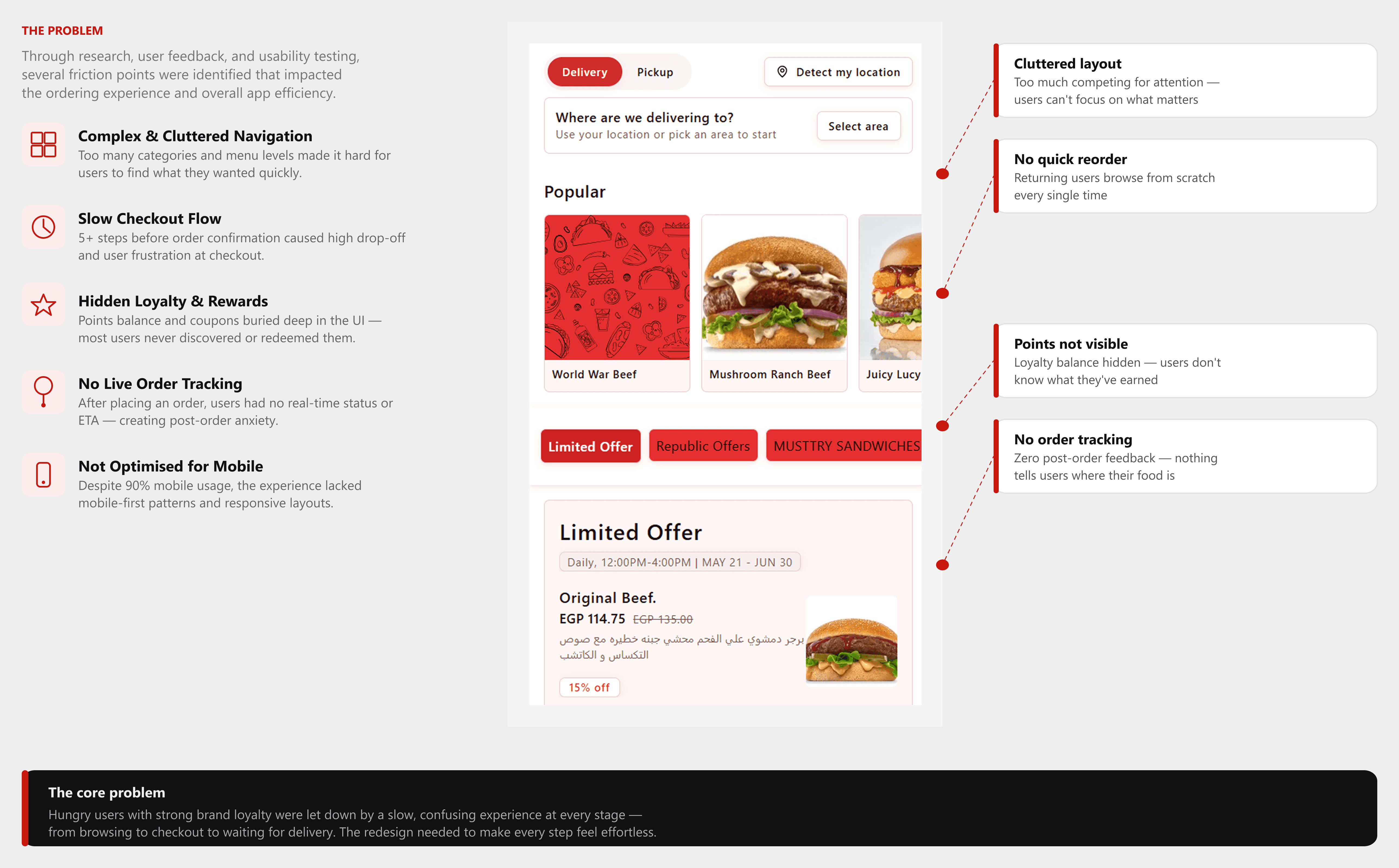
The old platform relied on a traditional structure with weak hierarchy and outdated visuals, making the ordering process feel difficult and disconnected from user expectations.
UI/UX
Visual Identity
Web Design

The redesigned experience focuses on reducing friction throughout the customer journey, making it easier for users to browse, customize, and complete orders confidently.
02
Research Phase
Analyzed leading fast-food and delivery apps to identify usability patterns, visual conventions, and gaps Burger Republic could own.
Created personas representing the core audience: young adults, students, fast-food lovers, and delivery-first users.

Research Insights
Users abandon carts when checkout requires more than 3 steps
High-quality food imagery directly increases add-to-cart rates Clear category tabs are the most used navigation pattern in food apps
03
Define Phase
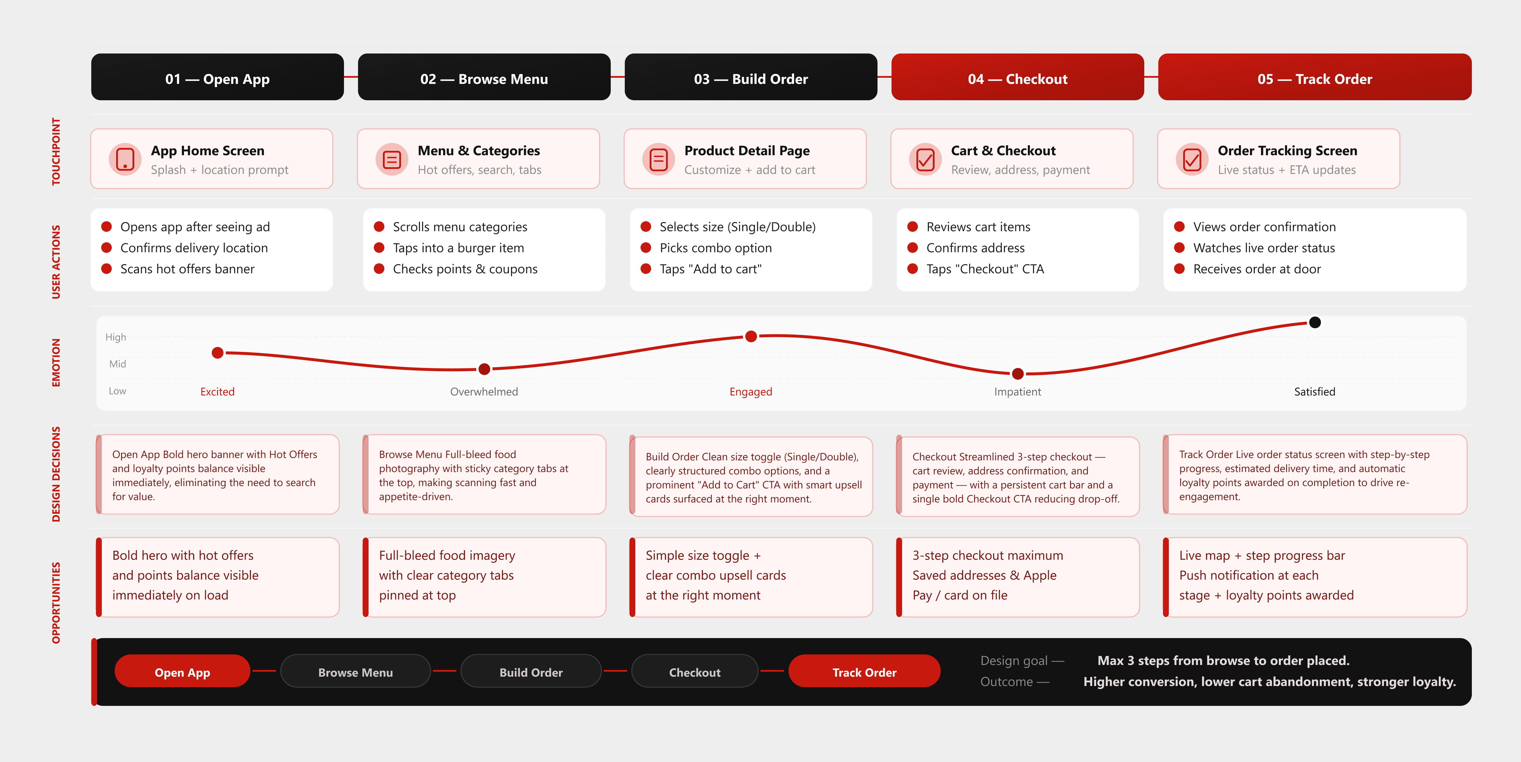
Delivery-first users need a fast, visually engaging, and intuitive ordering experience — but the existing app makes it difficult to browse, decide, and checkout confidently, leading to drop-off and low re-engagement.
Mapped the complete end-to-end journey of a delivery-first user — from the moment they open the app craving something good, through browsing, building their order, and tracking it to their door. Every stage was examined for friction, hesitation, and drop-off points that the redesign needed to eliminate
04
Ideation Phase
Restructured the app's navigation and content hierarchy to reduce cognitive load and surface the most important actions faster.
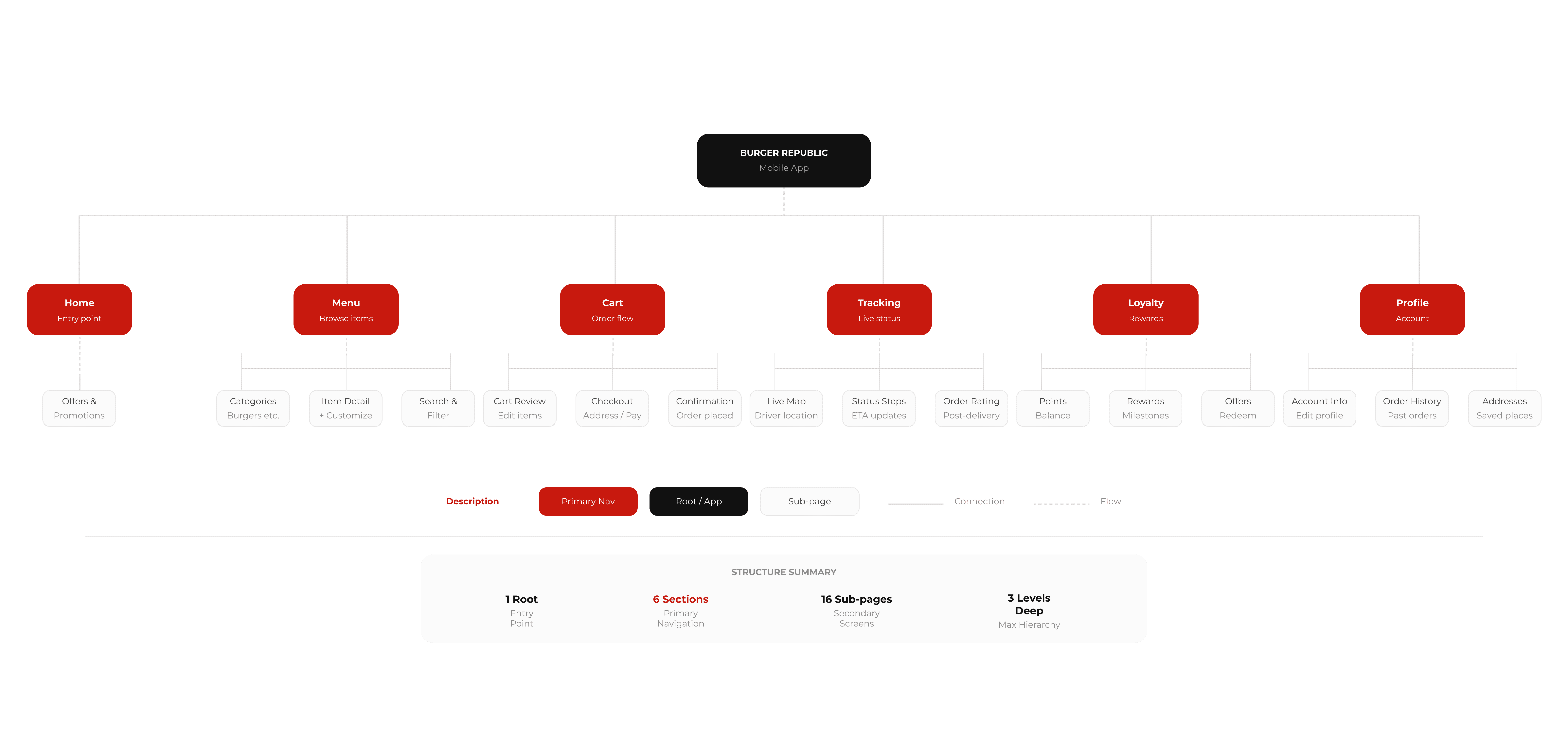
Low to Mid-Fidelity Exploration Produced low and mid-fidelity wireframes to explore layout structures, content hierarchy, and key interaction patterns across the full logged-in flow — from home screen to post-order tracking.

05
Design Phase
The design language centers on a bold, appetite-driven aesthetic. A deep crimson red (#C8190E) anchors the brand identity — energetic, urgent, and unmistakably fast-food — offset by a clean white canvas that lets food photography breathe. Typography is assertive and modern, using weight contrast to establish clear hierarchy. UI elements are tight and gesture-friendly: prominent card surfaces with rounded corners, sticky CTAs, and full-bleed imagery that makes every item feel craveable. The overall tone is confident and direct — premium quality delivered at speed.

