Miyar Capital Redesign
Led a full UX redesign for Miyar Capital to transform a complex and fragmented experience into a clear, intuitive, and user-friendly financial platform, improving navigation, usability, and user confidence.

01
Project Overview
Miyar Capital is a Saudi investment firm offering asset management, advisory, and securities services. The goal of this project was to redesign their website to reflect their credibility better, simplify complex information, and guide users toward meaningful actions.
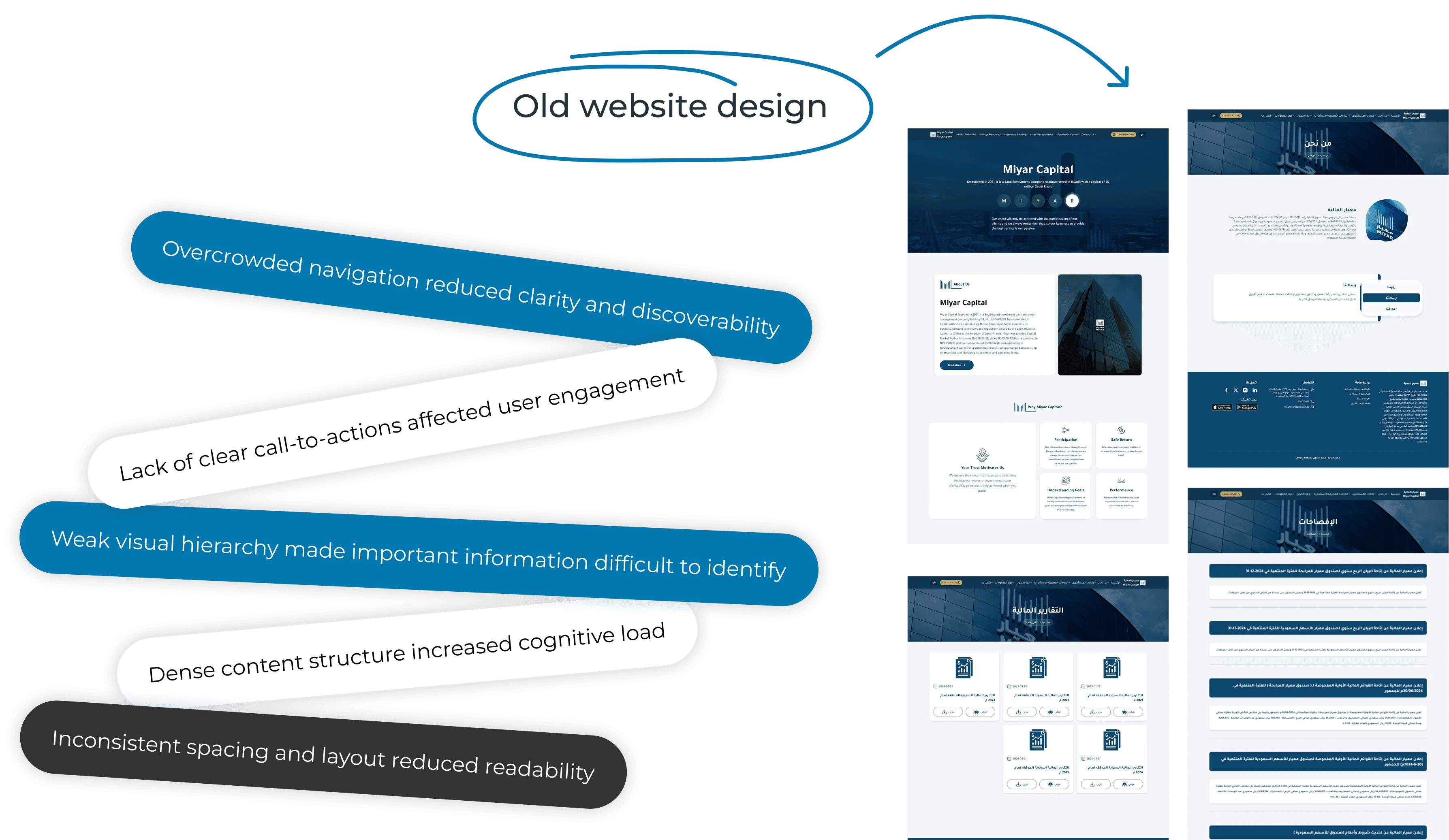
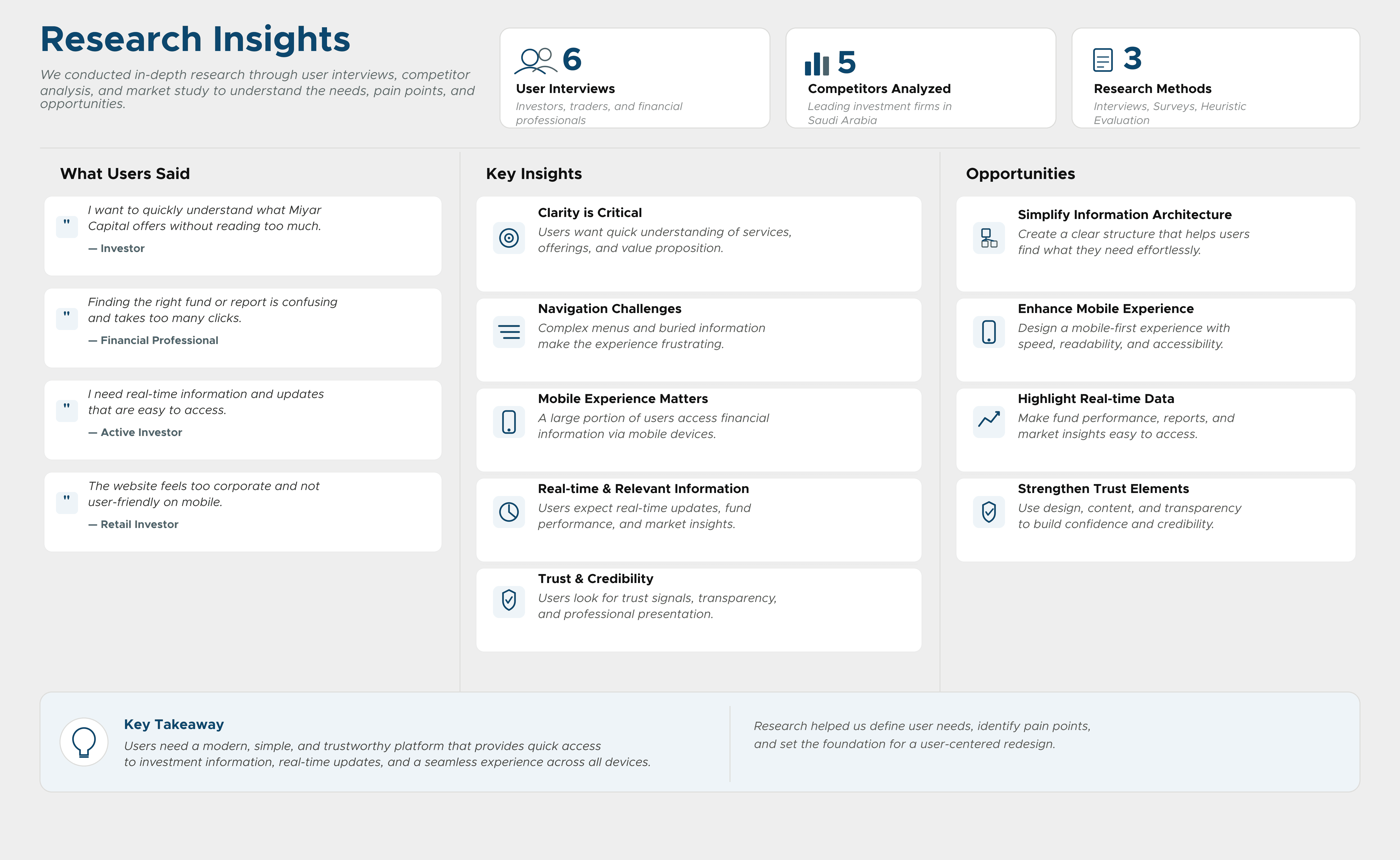
The existing experience lacked clarity, a modern structure, and strong user flows, making it difficult for potential investors to understand the services or take action.

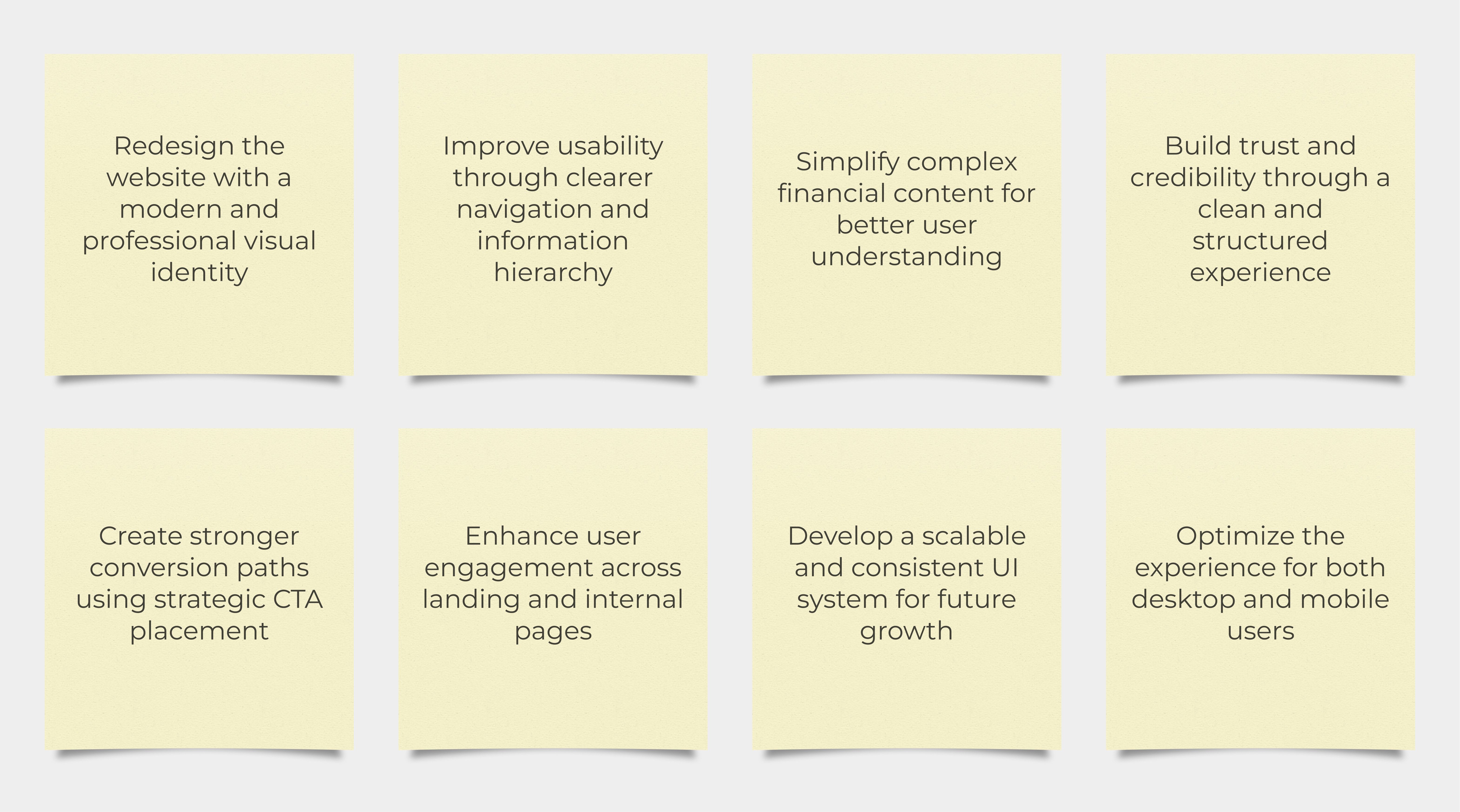
The primary goals were to improve usability and navigation, establish a trustworthy visual language, and ensure the platform works seamlessly across all devices. Secondary goals included reducing drop-off rates on key flows and elevating the overall brand perception.
The previous website lacked clear structure, modern visual hierarchy, and intuitive navigation, making it difficult for users to understand services and engage confidently with the platform.
UI/UX
Visual Identity
Art Direction
Led the end-to-end UX/UI design process, including research, competitor analysis, wireframing, user flows, UI design, and responsive layouts.

02
Research Phase
Analyzed regional and global investment platforms to identify usability patterns, strengths, and opportunities for differentiation.
Key Findings: - Most competitor websites felt overly corporate and difficult to navigate - Heavy information density reduced readability - Limited focus on user engagement and conversion

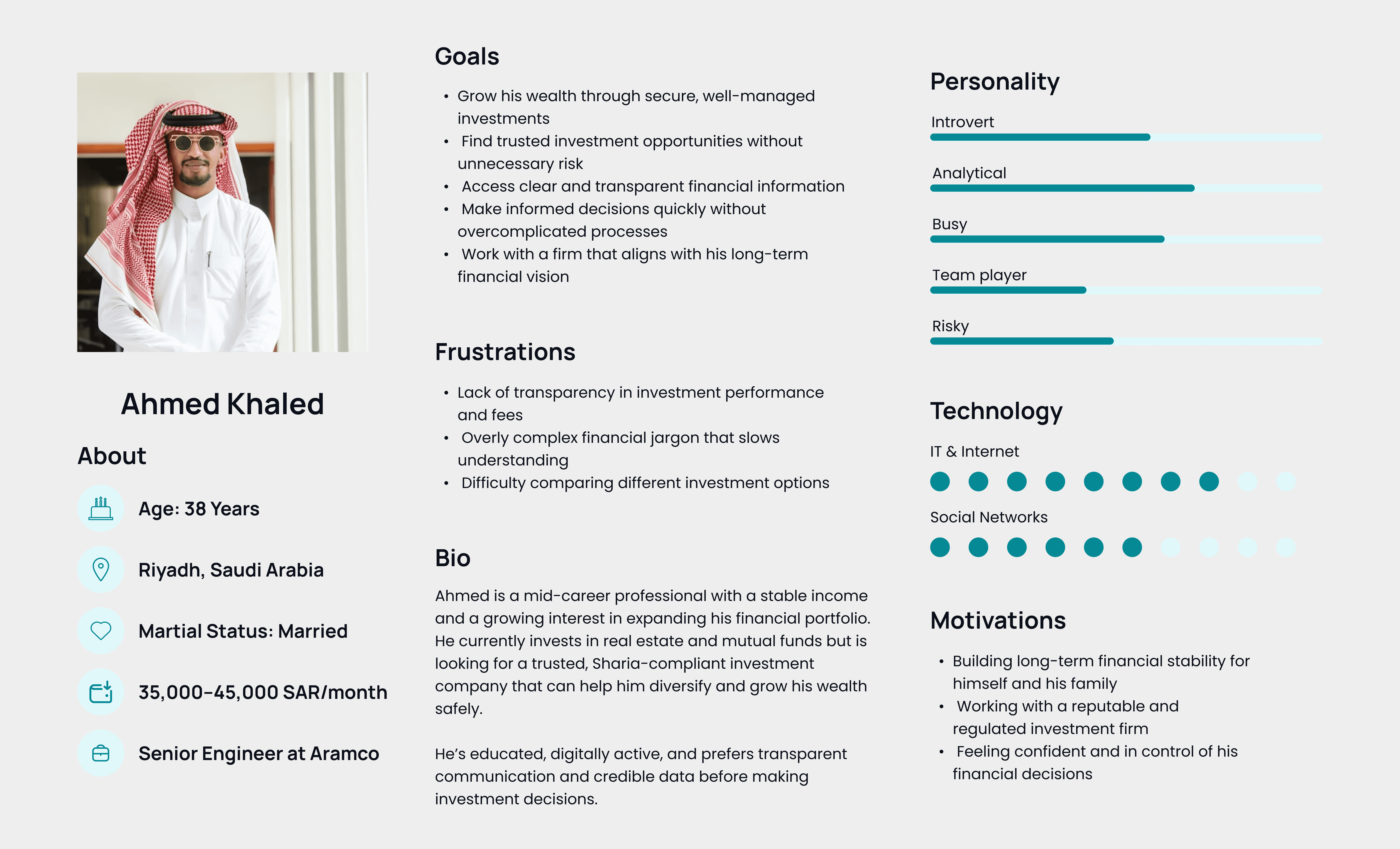
Created personas to better understand investor expectations, behaviors, frustrations, and motivations.
Research Insights
The research revealed that users value simplicity, credibility, and structured content when interacting with financial platforms.
Key Insights - Trust is strongly influenced by visual clarity. - Simplified navigation improves engagement. - Users prefer quick access to key services and information.
03
Define Phase
Investors need a clear and trustworthy platform to explore financial services and make informed decisions, but existing experiences are often complex, outdated, and difficult to navigate.

Mapped the primary user flow to understand how users discover services, build trust, and take action throughout the platform.
Main Flow Homepage → Explore Services → Learn More → Contact / Register Interest

04
Ideation Phase
To simplify navigation and support business goals, user flows were created to define how visitors move between key sections, discover services, access investment information, and complete their intended actions efficiently.
Main Sections - Home - Who We Are - Investor Relations - Investment Banking - Asset Management

The strategy focused on creating a balance between institutional professionalism and modern user-centered design principles. Focus Areas - Improve information clarity. - Simplify navigation. - Strengthen visual hierarchy. - Create stronger conversion points.

05
Design Phase
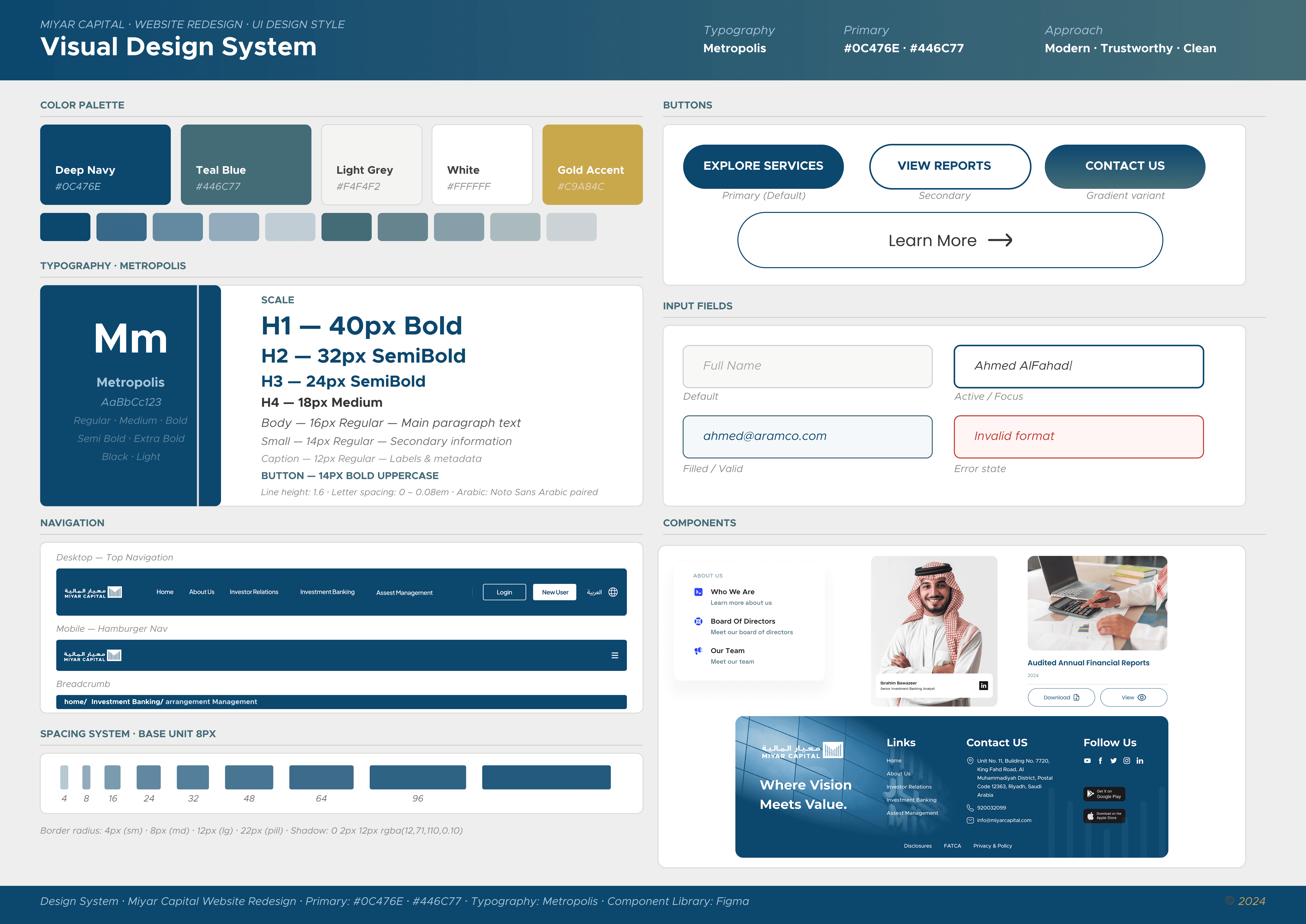
The visual design system was built from the ground up — establishing a color palette, typography scale, spacing system, and reusable component library. The style guide ensured consistency across all screens while giving the brand a polished, modern identity that communicates reliability and professionalism.